
This is the fifth in a series of posts about creating a web component library using Stencil.js - Check out the first post
At this point we’ve built a fairly basic component that looks great and functions correctly. We’re now going to move on to a new component that has more complex functionality and interaction. Tabs are one of the basic components every library needs. Each tab is effectively a button, but those buttons work together and maintain a shared state with regards to which tab is currently active. This is a perfect candidate for our next component, as it can use all the rest of the decorators Stencil provides.
Building Blocks
Let’s first create an incredibly simple component with no styling or functionality. Start by creating a new folder, tabs, which contains three files: tabs.tsx, tab.tsx, and tabs.scss for our styles. Let’s start with the building block tab component.
This will be a little different. It will be a component, but will not have a render function. It will instead keep track of a couple of props for us. Add the following to your tab.tsx file:
@Component({
  tag: 'mtn-tab',
  shadow: true
})
export class Tab {
  @Prop() label: string;

  @Prop() active: boolean;

  @Prop({ reflectToAttr: true }) disabled: boolean;
}
We’ve got props for the label, which the tab will display, a flag that shows whether or not it’s active, and of course a disabled property. If we wanted to keep more metadata associated with each individual tab, this is where we’d add it.
Now let’s dig into our main tabs component in tabs.tsx. We first need to render the basic structure of the component. Let’s start with the following:
export class Tabs {
  render() {
    const classMap = this.getCssClassMap();

    return (
      <div class={classMap}>
        <button role="tab">Tab 1</button>
        <button role="tab">Tab 2</button>
        <button role="tab">Tab 3</button>
      </div>
    );
  }

  private getCssClassMap(): CssClassMap {
    return {
      'tabs-list': true
    };
  }
}
Let’s also get some very basic styling in place to our host component and .tabs-list class. In our tabs.scss file we’ll put in a few blocks:
@import '../../styles/variables.scss';

:host {
  display: block;
  box-sizing: border-box;
}

.tabs-list {
  border-bottom: 1px solid #dddddd;
  padding: 0 5px;
}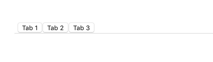
This obviously looks really ugly and not at all like tabs, but it’s a start, and we simply need to style them to be a little nicer. Let’s add a few simple styles to make them look beautiful.
Let’s give each button a .tab-button class and an .active class to the first one. Now for the class definition:
.tab-button {
  border: 0;
  font-size: 14px;
  font-family: $font-family;
  padding: 8px;
  outline: none;
  cursor: pointer;

  &:hover:not(:disabled):not(.active) {
    border-bottom: 3px solid $light-dark;
  }

  &:disabled {
    opacity: 0.4;
  }

  &.active {
    border-bottom: 3px solid $blue-steel;
    font-weight: 600;
  }
}
We’re doing a couple things here that you can work out, but basically we’re removing the styling that buttons have, tweaking the font, and then adding a nice border at the bottom of the tab when it’s active. We’re also doing a fun little hover border with a light gray color when hovering over a tab that’s neither disabled nor currently active. We’re of course also defining what a disabled tab looks like.
Now our tabs look like actual tabs, but they’re also hardcoded. We want to be able to specify how many tabs we want, as well as customize their labels. Here’s where we get into the other decorators.
State and Element Decorators
First let’s define the tabs and dynamically create them. These tabs define how we render our component, so we’re going to define them along with the @State() decorator:
export class Tabs {
  @State()
  tabs: HTMLMtnTabElement[] = [];

  //...
}
The @State() decorator is used to manage data that is internal to the component. Any changes to this property will cause the component to re-render, as the state has changed.
You’ll also notice I’m using the HTMLMtnTabElement[] type for the tabs. This is an interface that is created automatically by Stencil in your components.d.ts file. It gives you some nice intellisense for your component, with the standard HTML element properties and methods, as well as those you define on your component.
With our tabs, we want to use the following syntax to define them:
<mtn-tabs>
  <mtn-tab active label="Tab 1"></mtn-tab>
  <mtn-tab label="Tab 2"></mtn-tab>
  <mtn-tab label="Tab 3" disabled></mtn-tab>
  <mtn-tab label="Tab 4"></mtn-tab>
</mtn-tabs>
Let’s use the componentWillLoad() lifecycle hook to grab the tabs we’ve specified and render them. We’re also going to have to use the @Element() decorator so we can reference it in our method.
The @Element() method is pretty simple. It returns an instance of the host HTMLElement of your component. We want to query elements within our own component, so we’re going to use that in our componentWillLoad() method like so:
export class Tabs {
  // Our host element
  @Element()
  el: HTMLElement;

  @State()
  tabs: HTMLMtnTabElement[] = [];

  componentWillLoad() {
    // Grab tabs from this component
    this.tabs = Array.from(this.el.querySelectorAll('mtn-tab'));
    if (this.tabs.length === 0) {
      throw new Error('[mtn-tabs] Must have at least one tab');
    }
  }
  //...
}
This snippet grabs all mtn-tab elements and sticks them in our tabs property. Let’s then adjust our render() function to use the dynamically grabbed tabs.
export class Tabs {
// ...
render() {
const classMap = this.getCssClassMap();
return (
<div class={classMap}>
{this.tabs.map((tab: HTMLMtnTabElement, index: number) => {
const tabClassMap: CssClassMap = {
'tab-button': true,
active: tab.active
};
return (
<button
role="tab"
disabled={tab.disabled}
class={tabClassMap}
onClick={() => this.openTab(index)}>
{tab.label}
</button>
);
})}
</div>
);
}
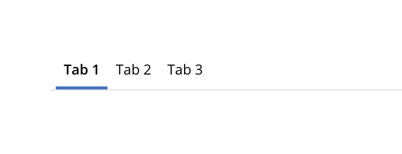
}If you’ve ever used React, you’ll recognize what we’re doing here. Remember that TSX is TypeScript, not actual HTML, so we can do things such as transform arrays into other rendered elements. We’re doing this in our function here. We’re taking this.tabs and using the map() function to transform those tabs into elements we want to render on screen. In this case we’re rendering our buttons with the .tab-button class, and we’re conditionally applying the .active class to the tab which is marked as active. We make sure to assign the disabled attribute conditionally to those tabs that we’ve marked as disabled. We also specified a click handler, onClick, that we’ll implement now.
Method Decorator
We want to implement our click handler on a tab so we can correctly change tabs when clicked on. For this we’re going to use the @Method() decorator. This decorator exposes class methods on the public API for the component. In other words, you can call those methods simply by querying for the element and calling its method, like so:
const tabs = document.querySelector('mtn-tabs');
tabs.openTab(2);
In order to keep methods internal to the component we want to simply omit the @Method() decorator. By my judgement, methods should be kept internal unless there is a valid reason for them to be exposed. In the case of this openTab() function, there is definitly a good reason to expose it, so let’s implement it now. According to the docs, public methods must be async so we’re making sure to mark it as such.
export class Tabs {
  // ...

  @Method()
  async openTab(index: number) {
    if (index >= this.tabs.length) {
      throw new Error(
        `[mtn-tabs] Index ${index} is out of bounds of tabs length`
      );
    }
    if (!this.tabs[index].disabled) {
      this.tabs = this.tabs.map((tab, i) => {
        tab.active = i === index;
        return tab;
      });
    }
  }

  // ...
}
We first make sure that the index requested exists. We can’t select a tab that doesn’t exist. We then check that the tab that has been clicked is not disabled. We don’t want a disabled tab to have any functionality. Otherwise we change the active flag on each tab, depending on whether the index of the tab matches the index we passed into the method. If it matches, we set active to true, otherwise we set it to false.
If you save and check, your tabs now change when you click on them! They’re starting to work just how we want them to. There are a few more things, however, that we want to do before we finish up this component.
Event Decorator
We exposed the openTab() method on the public API of our component. This is obviously useful to be able to programatically change tabs. What about being able to determine when tabs have changed and react to that change? We would use custom Events with the @Event() decorator.
With our components, we can define an EventEmitter to emit Custom DOM events. This is really easy with Stencil. Let’s define ours now and emit the changed tab in our openTab() method:
export class Tabs {
  // ...

  @Event({ eventName: 'change' })
  onChange: EventEmitter;

  @Method()
  openTab(index: number) {
    if (index >= this.tabs.length) {
      throw new Error(
        `[mtn-tabs] Index ${index} is out of bounds of tabs length`
      );
    }
    if (!this.tabs[index].disabled) {
      this.tabs = this.tabs.map((tab, i) => {
        tab.active = i === index;
        return tab;
      });
      this.onChange.emit({ tabId: index });
    }
  }

  // ...
}
We created our onChange which is an EventEmitter that we imported from Stencil. We also changed its name using the eventName config property in the decorator. You can change this if you want or keep it the same, it’s up to your preference. The only suggestion is that you keep your naming consistent.
We then call the emit() function on the EventEmitter and emit an object with a tabId of the changed tab. We can now listen to this event outside of this component and react to it, like follows:
const tabs = document.querySelector('mtn-tabs');
tabs.addEventListener('change', event => {
  // You'll find your emitted object under event.detail
  console.log(`CHANGED TABS TO INDEX ${event.detail.tabId}`);
});
Now you can do things such as swapping out views when the currently active tab changes! Events are super handy when it comes to any good component library. We could add all sorts of events to our components. In the case of our tabs, however, we’ll leave it with this one event.
Listen Decorator
The @Listen() decorator is closely related to the @Event() decorator. Basically it’s a shorthand way of listening and reacting to a DOM Event. You could either listen to your own component event you’ve defined, or you could listen to a standard event, such as the scroll event. It works like this:
export class MyComponent {
  @Listen('body:scroll')
  handleScroll(ev) {
    console.log('The body was scrolled', ev);
  }
}
We’re not using this decorator in our tabs component, but it’s very simple to use. Other use cases might be a keyup listener which you could use to, for example, implement the Konami Code on your component to unlock a fun easter egg.
Watch Decorator
There is one more main decorator in Stencil’s toolkit, and that’s the @Watch() decorator. It is used to watch a specific property on the component class, and decorates a method which is called upon that property being changed. It calls the method with the oldValue and newValue, so you can react with either value in mind. We’re not going to use it in our tabs component, but we could if we wanted. Instead of emitting the new index in the openTab() function, we could instead listen to the tabs property and emit the newly active tab from there, perhaps like this:
export class Tabs {
  // ...

  @Watch('tabs')
  tabsChangeHandler(newValue: HTMLMtnTabElement[]) {
    const newIndex = newValue.findIndex(tab => tab.active);
    this.onChange.emit({ tabId: newIndex });
  }

  // ...
}
In that function we don’t care about the old value, we just want to return the new tab. This works identically to how we were doing it previously, it still emits the new tab when the tabs change. We’re not using this method in our component, however, because we have to search for the index of the new tab each time the tabs are updated, whereas we know for certain which tab is the new one in our openTab() method, so we’ll stick with that. This is how you use the @Watch() decorator though, and it’s useful for other situations and components, so it’s worth keeping around in your toolbox.
Next Steps
Congratulations! Your tabs component should be fully working now! We have a public API to change tabs, an event we can listen and react to, and internal state that helps us re-render appropriately when needed. The decorators we’ve gone over in this and previous posts form the foundation of building web components with Stencil. We’ve covered a ton of ground in this series, but there’s still more to be had! One of the most important aspects of developing software has been missing thus far, and that’s testing your code. We’ll be going over that in the next post, coming soon!
Simply want to see the end result repo? Check it out here