
This is the fourth in a series of posts about creating a web component library using Stencil.js - Check out the first post
In the last post we created a very simple button component. We’re now going to extend that with more options and functionality to be more fully featured. I personally want to have a couple of color options for this button, a couple of button shapes, and a few sizes.
Component Props
To start into this, we’ll need a few props to allow the user to specify what they want. Let’s call our props color, shape, and size. We also can have multiple button types such as submit and reset, just like a regular HTML button, so we’ll add that as a prop too.
@Prop()
type: 'button' | 'reset' | 'submit' = 'button';

@Prop()
color: 'primary' | 'accent' | 'light' = 'primary';

@Prop()
shape: 'square' | 'round' = 'square';

@Prop()
size: 'small' | 'default' | 'large' = 'default';
If you’ve barely/not used TypeScript before, you’ll notice that instead of defining my types for these props to be of type string, which technically they are, I’m going a step further and defining that each prop can be one of several specific strings. This allows for much more effective IntelliSense when you’re using this component. I’m defining up front a few specific sizes, colors, shapes, and types that I’m going to be implementing. On top of that, I’ve initialized those props to my preferred defaults, so that if you simply call my button component with no defined props, it’ll look like a default button.
Class Map
Next I’m going to be using those props to build a map of CSS classes to apply to my component. I typically like to define an interface called CssClassMap for this purpose. Let’s create that file at src/utils/interfaces.ts, as it’s something I’ll be reusing for all my components, and use the following content for the file:
export type CssClassMap = { [className: string]: boolean };As you can see, I’m defining this class map type as a map of a key, the class name, and the value being a boolean. Effectively I’m going to be specifying whether I want classes to be applied or not. Now that we have this interface, let’s write a method that builds this class map on render.
export class Button {
  // ...

  render() {
    const classMap = this.getCssClassMap();

    return (
      <button type={this.type} class={classMap} disabled={this.disabled}>
        <slot />
      </button>
    );
  }

  private getCssClassMap(): CssClassMap {
    return {
      [this.color]: true,
      [this.shape]: true,
      [this.size]: true
    };
  }
}
As you can see, I’m calling our function from the render method to get the class map, a fairly simple one in this case, and am applying that to the button. You may also have noticed that I also passed the type prop to the button as well. Now that we have the correct classes being applied, let’s actually implement those classes. First we need the correct colors, so let’s add a few more SCSS variables to our src/styles/variables.scss file.
//...

// Brand Colors
$blue-steel: #4571c4;
$blue-steel-dark: #315db0;
$coral: #c75943;
$coral-dark: #a83a24;
$light: #f0f1f2;
$light-dark: #e2e3e4;
Now that we have the variables available, let’s implement the classes themselves. We don’t need to implement the default classes as they are the default that we’ve already implemented.
button {
  //...

  // Color variations
  &.accent {
    background-color: $coral;

    &:hover {
      background-color: $coral-dark;
    }
    &:active {
      background-color: darken($coral-dark, 10%);
    }
  }
  &.light {
    background-color: $light;
    color: rgba(0, 0, 0, 0.7);

    &:hover {
      background-color: $light-dark;
    }
    &:active {
      background-color: darken($light-dark, 10%);
    }
  }

  // Shape variations
  &.round {
    border-radius: 50px;
  }

  // Size variations
  &.small {
    padding: 2px 8px;
    font-size: 12px;
  }
  &.large {
    padding: 8px 20px;
    font-size: 16px;
  }
}
For the color changing classes, we need to re-implement our hover and active states. We do not need to re-implement our disabled state since our existing one simply applies a lower opacity, looking great in any color. Making the button round is trivial, and then we finally tweak the padding and font-size of our button to look good as a large or small button.
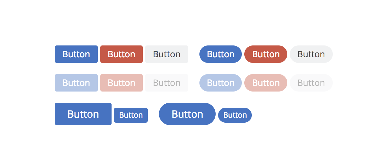
Now that we’ve implemented these classes, we have some pretty incredible looking button web components!
Next Steps
We now have an awesome button component we can use anywhere! This is a simple first component, so we’re not dealing with many of the other decorators such as @Watch(), @Method(), or @State(). We’ll get into those with a new component that is more complex in our next post. See you in the next one!
Simply want to see the end result repo? Check it out here