
This is the third in a series of posts about creating a web component library using Stencil.js - Check out the first post
We’ve done a lot of setup so far, now let’s create our first component. This is the foundation of any component library: the button component. Let’s rename the my-component folder to button, and all the files inside replacing my-component to button. We’re now ready to build our button.
Component Decorator
The first thing we’re going to do is change the contents of button.tsx. We’re going to change the tag in the @Component decorator to our actual tag name, and the styleUrl to point to our newly renamed SCSS file, in my case the following:
@Component({
  tag: 'mtn-button',
  styleUrl: 'button.scss',
  shadow: true
})
Note the shadow property. This is declaring that we will be using the Shadow DOM for this component. This has many benefits including an isolated DOM and scoped CSS, among others. We’ll definitely want to be taking advantage of this, as it’s one of the key parts of web components.
Render Method/JSX
Next we’re going to change the class to render a plain button with a single prop.
export class Button {
  render() {
    return (
      <button>
        <slot />
      </button>
    );
  }
}
Looking at the render method, you’ll notice we’re not writing HTML. We’re using a JavaScript syntax extension called JSX or JavaScript XML. Note with Stencil we’re actually using TSX, a file with the ability to write JSX using TypeScript. Let’s change the markup to render a standard HTML button. We’re also placing a slot inside the button. This is a part of the suite of browser web component APIs; it allows us to fill that slot with markup defined by the consumer of the component. In our case, consuming this component would look like this:
<mtn-button>Click Me!</mtn-button>The text “Click Me!” is projected down to the slot within the component. The markup in the component will be the following:
<button>
  <slot>Click Me!</slot>
</button>
This button component is currently incredibly simple. With more complex components we will obviously have more markup, and will occasionally use multiple named slots to project multiple bits of markup down to the component. For now, we’ll stick with that for our button.
Component Props
You’ll have noticed by now if you’re familiar at all with React that these components look and function very similarly to React components. Along those lines, we’re now going to define a prop. An important piece of functionality for a button is to disable that button. Let’s use the @Prop() decorator to define a disabled property. We’re also going to pass that disabled property down to our actual button. We’ll update our class like so:
export class Button {
  @Prop({ reflectToAttr: true })
  disabled: boolean;

  render() {
    return (
      <button disabled={this.disabled}>
        <slot />
      </button>
    );
  }
}
We’ve defined a property on the class called disabled, and added a @Prop() decorator to it. We’ve also passed in an object with a reflectToAttr key we’ve defined to be true. According to the Stencil Prop Docs, using that makes sure our disabled prop stays in sync with an HTML attribute. In this case we definitely want that because we’re using a disabled attribute.
We are also adding disabled={this.disabled} to our button in the component. This will conditionally apply the disabled attribute depending on whether or not the disabled prop is defined.
Styling Our Button
Currently this is an ugly HTML button. We’re obviously going to change that. I encourage you to come up with your own style guide and design for your components, but you’re of course welcome to copy what I’m doing. First off I’m going to create a file at src/styles/variables.scss for my color variables. If I have to change colors, I want it to apply to all the colors rather than change them one by one, so I’m using SASS variables to do that. I’m going to start with my font, a couple basic colors, and my primary color shades which is all I’m focusing on right now.
// Font Family
$font-family: 'Open Sans', 'Helvetica Neue', Arial, Helvetica, sans-serif;

// Basic Colors
$white: #ffffff;
$black: #000000;

// Brand Colors
$blue-steel: #4571c4;
$blue-steel-dark: #315db0;
Now that I’ve got my font and colors established, I’m going to give my button some classy styling.
@import '../../styles/variables.scss';

:host {
  box-sizing: border-box;
}

:host([disabled]) {
  pointer-events: none;
}

button {
  font-family: $font-family;
  cursor: pointer;
  border: none;
  background-color: $blue-steel;
  color: $white;
  line-height: 20px;
  font-size: 14px;
  padding: 4px 12px;
  border-radius: 3px;

  &:hover {
    background-color: $blue-steel-dark;
  }
  &:active {
    background-color: darken($blue-steel-dark, 5%);
  }
  &:disabled {
    opacity: 0.4;
  }
}
First I’m importing my variables for use. I’m then using the :host selector, which allows us to select the shadow host of the Shadow DOM, for a couple different things. First of all I’m setting box-sizing: border-box to the host element. I personally prefer using the border-box sizing to not take into account borders for the height and width. It makes more sense to me personally. Next I’m using the host selector to only select the host when it has a disabled attribute applied to it. In that case I’m applying pointer-events: none to the element. This makes it so setting a click handler on the element will not fire when the button is disabled.
Next I’m styling my button itself. You’ll notice and possibly worry about me globally styling the button element. This is not a problem because we’re using the Shadow DOM, and this is one of its best benefits. All of your styling is scoped to the component’s Shadow DOM, no styles from outside can penetrate it, and no styles from inside can mess up anything outside of it. It’s pretty awesome.
The rest of the styles are pretty straightforward. I have the button styles, the background color darkens on hover, and darkens even more on click. When it’s disabled, I apply opacity: 0.4 to make it look disabled.
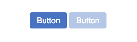
If you haven’t already, make sure you run npm start to start up your dev server and it’ll automatically open in your browser. Go ahead and add your button to your index.html page so you can test your component. I added the following markup:
<mtn-button>Button</mtn-button> <mtn-button disabled>Button</mtn-button>When your page refreshes automatically you should see your beautiful new button component in both its disabled and non-disabled states!
Next Steps
There you have it! A classy button component that looks great and has basic functionality. There’s obviously a lot more to a button (and most components) that will implement, but we’ll do that in our next post. See you there!
Simply want to see the end result repo? Check it out here